Your store’s navigation is the first introduction many get to your brand. Some are excellent, others are confusing, and few need a complete reworking. Regardless of where you’re at in your journey, here are a few ecommerce navigation best practices you should apply.
Designing user-friendly navigation for your ecommerce store is part science, part art. You want to make it easy to find products, the cart, and important pages without it feeling overly busy or displaying everything.
Rather than picking on brands whose user experience (UX) needs some serious work, we’ll focus on ecommerce navigation best practices. What we’ll highlight will give you a road map to improve your UX and boost your SEO efforts.
#1 Separate Out Navigation Into Two Menus
Having a single navigation menu is the simplest way to confuse your customers. You’re asking them to focus on too much at once. Thankfully, we can separate things and use two menus, each with its own function.
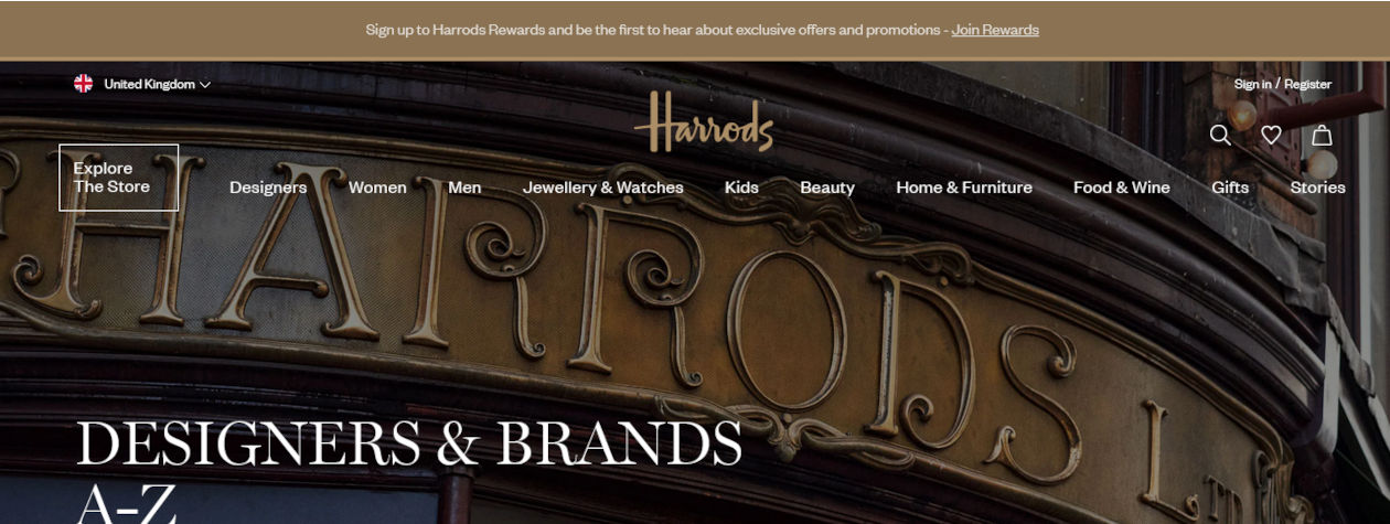
The top menu is ideal for important pages such as the cart, contact, and help. Use the second menu for top product categories, allowing users to find items to buy.

screenshot of Harrods.com
#2 Use A Top Nav Menu Bar For Important Pages
Having a top navigation menu bar allows you the space to improve the user journey. Typically, this menu contains the cart, account login, wishlist, and search.
The majority of stores now use icons for these over text, which again simplifies the layout and improves the UX. Also, icons scale better on the mobile viewpoint.
Try to avoid giving too much information on this top bar. You can use the footer to link to your blog, delivery options, T&Cs, and more. Another option is to have all of these important pages as part of the post sign-in screen, allowing the customer to easily find this information.
It’s best to keep things simple and only include a few options here. Don’t try and give the user every possible option.
#3 Include Benefits In Top Nav Bar
With plenty of space available, you can include a benefit or two in the top nav bar on the desktop viewpoint. You’d want to hide them on mobile or it’ll look cluttered!
Your benefit could be something as simple as Free Shipping, a discount on a particular item, or a bundle offer. You’ll want to test different offers and update them regularly.
Here are some ideas to inspire you:
- Buy one pair of jeans and get the second half price
- 10% off when you sign up for our newsletter
- Build a custom gift with our Create Your Own Hamper service
- Pay in 3
- Free shipping on orders over $150
- Order before 2 pm for same-day dispatch

various ecommerce websites
#4 Allow Users To Search For Items
There’s a search bar, and there’s a Search Bar… You should focus on the latter! What I mean by this is to ensure you have the option to shape the user journey and gather data from the search function.
Many ecommerce brands either think they don’t need a search function or use a basic version. A big mistake!
For example, if you’re using content marketing as part of your SEO plan, having a search function can help users find blogs, videos, and content that can hook them in.
Another example: your most popular product is a girl’s blue sweater. You could make it sticky on the homepage or add it to the dropdown of the search bar with a direct link to that product. You’ll cut down the amount of time users waste trying to find it.
The easier it is for users to find products or categories, the more likely they will convert. So tailor the search function to speed up the process.
Another way to use the search function is to track what visitors are looking for. You could find some interesting ideas for new products or collections.

screenshot of berrysjewellers.co.uk
#5 Second Menu Bar For Top Categories
By spitting your ecommerce navigation into two, you can use the second, lower menu to do the heavy lifting. Again, try to keep the option to a minimum as this will look the best on both desktops and mobile devices.
The aim of this menu is to make it easy to find product groupings. So think about how your users want to find things.
If you sell watches, you might want this menu to include links to Mens, Ladies, Brands, and Sale items. These options make it easy to quickly discover items.
Another example, say you make candles, your menu could be Candles, Reed Diffusers, Room Sprays, and Sale items. Nice and simple!
Again don’t try and cram this menu full of options or think you can only need a single navigation bar when you have enough options for two.
#6 Use Dropdowns For Subcategories
On desktops menu dropdowns are great. However, they don’t always work on mobile devices, as you might need to endlessly scroll to find the right option. So you want to test dropdowns across different browser viewpoints.
Dropdowns allow you to create links to deep pages that help users find what they’re after faster. If you’re unsure what to include in these menus, start with the basics.
If your top menu covers the main product categories, these submenus can cover more defined groupings, such as products by type, style, price point, or brand.
As you dive into your analytics and talk with customers, you’ll realize how to better shape the user’s journey and make it easy for them to find popular products.

screenshot of fortnumandmason.com
#7 Use Breadcrumbs
If you’re not sure what breadcrumbs are, Hubspot has this great description: Breadcrumbs are a navigational aid that allows users to keep track of their current location on a website or interface.
When correctly set up, breadcrumbs guide the user, allowing them to find more products or support. You don’t want them to direct the user only to the homepage! An ecommerce navigation fail!
Consider using them on product pages, blog posts, and support pages. Even static breadcrumbs can help users. Ideally, you want to use dynamic breadcrumbs that help signpost the user back to the main category page and can automatically update based on the user’s flow.
#8 Don’t Overlook The Footer
While the SEO value of links in the footer section doesn’t matter as much as they used to, these links do help the user. So don’t overlook how you’re shaping the user’s journey with the footer.
Try to avoid dumping every possible link known to man in your footer and instead consider what options should be there that currently isn’t. You could have a link to your blog, physical stores, FAQ, shipping and returns, and social accounts.
As your top navigation evolves, it’s completely fine for your footer to change too. Use customer feedback to shape the experience and make it easy for users to find key information.

screenshot of clivechristian.com
Using These Ecommerce Navigation Best Practices
You now have a roadmap for creating an ecommerce navigation that helps your users easily find products and converts this traffic into sales. Remember, these tips work together to create a better overall user experience.
Building a better experience will take time and is never finished. There are always elements to tweak. So you’ll want to review your ecommerce navigation menus a few times each year.
Ready to move beyond the cycle of tactical experimentation and adopt a more strategic approach to growth?


